Thank you for taking time to visit, and I hope I am even a tiny bit helpful as I have been helped and blessed by so many others. I have been doing Calligraphy since teens, and card making for many years as well. In 1990 I delighted in the joys of stamping with ink and embossing after a trip to Cairns, Qld. In 2009 I discovered the brayer, 2010 the Cuttlebug, also have now taking to reading up on crafting blogs and lo! Here I am, on one of my own.

I live on the coast of eastern Australia. I am a Christian. I trusted in the LORD down here at the beach, amazingly it is not far from where I now live. It was over 50 years ago, after a Beach Mission Service at the age of 12 years

Monday 29 November 2010

"Every word of God is pure"...x 7

Well since this blog is called Cards and Calligraphy I thought it time to even up the balance with another calligraphy post. This piece of work I did was one of the biggest projects I have ever undertaken. I have had two other large projects which I may or may not post at later date.

  In October I was asked by a lady to do some Bible verse texts as Christmas gifts.
I gave her my portfolio to look through as I said if there is one I have done before she wanted she would save time and money by choosing one of them.

At first I thought she wanted one or two then she said it was five then; when the list was presented to me it had grown to seven. At first I was simply dumbfounded. However God enabled and a VERY big thanks to everyone who was praying for me in it also!
 
Now just little word of explanation with these works. Some of my works can take 50 + hours and more to do depending on the detail and layout size and the ornamentation. The Title Verse at the top of my blog was probably about 40 hours even the third and fourth time it would be 30+ hours because the layer building all takes time.

So due to the size of order I made a few rules.
1. Would all be the same A4 size approx. size and same frames etc. for ease of procuring.
2. I would chose from her list the verses I thought were easiest to do and there would be double ups i.e. more than one of them.
3. I would not do any of  raised gold leaf common in my work- although I did break this rule on one of them, my favourite one!

The seven finished were over 50+ hours of work. I will post details below.
There were a total of four texts, three of which were done twice. 
  
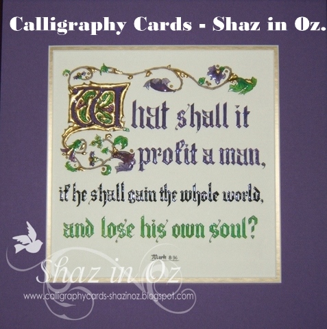
My favourite is the easiest one of the lot and I will post it first with a little close up of the work. 
 I was going to put up a post of work table too... it may shock some!? notice the Nestie (to the right) in the mix - funny where these things appear? 

 These Bible texts are all done in ink, Gouache, Gold leaf ( 23 carat) I  just bought my new book of gold leaf on trip to doctors in Sydney at Will's Quills in Chatswood - a calligraphers' dream place.
Just as well for my bank balance I only had a total of twenty five minutes in the shop before catching bus and train back to doctor's!
One other  stop to replenish paper and paint supplies too at another art store in Oxford St. Sydney. The best part of trip to doctors!
 
 The verse "As for God His way is perfect" is actually hanging in my bedroom in English grandmother's silver frame, and oval frame. I did it in the 1980's when I was using watercolours.
These are a whole lot harder to work with, and I find the gouache blends beautifully (with the exception of Alizarin Crimson, it can be a bit of a nightmare). This text was done in Alizarin Crimson (x2) .

   You can see from my work table that my paint palette is an end piece of a sheet of rag ie paper made from 100% rag as it works well with whole range of colours mixed on it. I just keep adding to them as I need the more shades.
And don't worry the paint spots on the table all wash off!! it is a wash and wear table. ;)
  Any questions or queries please just ask, thanks so much for looking at my blog!

And may God bless His word as it hangs in the homes to where it is going for these Christmas gifts of 2010!!.


Monday 22 November 2010

Part 3: Enlarging Cuttlebug Folders

Today I will try to illustrate how to enlarge folders by two other ways.
The first is the most simple and obvious, by only embossing part of the card, and thus as only a part needs to be embossed it can be made into a large card for those more formal occasions, like a wedding card (oops! I almost wrote weeding card, I think I have it on the brain - neglected garden!).


These two cards were ordered by the same lady. This first card is her grandson's wedding card and it was a first in many ways but was really fun as a learning curve. Used beads and flowers for the first time, and also the Swirls embossing folder came out a treat. it is a similar card design from one of Ikki's wedding cards, as I recall. (see her blog here).

The flowers were wrong colour (yellow!) so I coloured them using the Ranger Perfect Pearls, clear embossing pad to adhere, and sprayed a little water to set. Worked a treat! You can see the colour change a little on the green part of the flower.

I have made this card again a bit improved but forgot to take a photo - sigh!


The second card was for their engagement and the enlarging part of the folder was done by overlapping the pattern where it repeats itself half way through the pattern.


I tested the success of pattern repeating on scrap paper as I did with the other one below. Then I did it on the actual card. You will see one tiny spot where the join was little imperfect (see above left of the "S"), as this was the area where the pattern repeats itself.
You carefully roll the folder through till you feel the edge of the folder (like a bump) the first time then you reverse it out so you dont get the edge line.

Then you match up the pattern of the folder, (this one is called "Textile" by Cuttlebug)  and watch carefully as you bring it back from the other side of the card to the point where they join, taking great care you dont go to far.

I used some self adhesive silver braid from a local scrapbook shop, I have seen this in Sydney too last week, so it available elsewhere and suspect it may be from overseas like a lot of our things here.
The corners are Cuttlebug Vintage corners (Ikki's idea put double side tape on them, and alphabet, before cutting - easy to attach!).
Greeting is in mirri card and computer print of greeting before cutting and embossing spellbinders labels Four, initials in Olivia Cuttlebug, a small ribbon flower, and scored top and bottom to finish off the card on Eziscore.
Really enjoyed the learning curve on both these cards and hope you will also!
Any questions in case have not explained it properly please ask, I know what I mean but you may not at all!

Tuesday 16 November 2010

Lovely days...


Wonderful days with my visitors, not cards, but heaps of fun!
...getting ready for other visitors and medical appointments and tests etc, in it all a busy week, so there will be new post on cards next week, God willing.
However just want to post this pickie when we were walking along the beach on Saturday we were watching these two windsurfers playing along the wave line, so very clever, they look a little like birds but hey! they were windsurfers! oh to fly like a bird, but dont think I would be game.
(Note: To enlarge any picture for a better view just click on it)

Wednesday 10 November 2010

Part 2: Enlarging Cuttlebug Folders/ Backgrounds

Well, we have been enjoying some glorious spring weather lately, it really makes you appreciate life ( for those overseas our temperatures today and for the next week, if weather forecast is correct, are 15- 26C - thanks LORD!)


I am not sure how well this will show up for you but thought I would show you the white piece of paper I tested to see how the folder would join. You can see the slight pattern variation in the middle but because the form of the pattern has similar shapes throughout it is not really noticeable. It is more noticeable on the right if you look carefully.


The completed card turned out larger than originally planned basically because the Spellbinder Fleur de Lis Pendant shape cut in frosted mauve cardstock required the card be that size. This was why I looked at doing it on enlarged cuttlebug folder background.


Here is the finished card, as I said for a 60th Birthday.

Ingredients are:
1.Spellbinder Fleur de Lis Pendant and Borderabilites (note: it was only used for the edge of pattern as I needed one and half lengths of the die. This was the only way a join would not show in the Borderability, but thought that was a good variation).
2. Victoria Embossing folder, Cuttlebug.


3. Ribbon, not sure  what it is called, I used Bow Easy for the bow. The label die for ribbon tag is the centre die from Nellie Snellen Ovals. I printed Happy 60th on computer first before cutting out with die.

4. Card stock is from Stampin' Up Subtle Perfect Plum and Barely Banana.

5. 3D Pansy Picture - I cant remember what it is as I did it last year! also added Glossy Accents to give the lovely high shine.


I am off tomorrow to deliver it to the lady! Any questions, please just ask..

Next post, all being well, I will show the Cuttlebug Textile embossing folder also done in a similar way except it has a repeating pattern! Posting may be unpredictable over next two weeks, as it is very busy with guests, doctor's appointment and tests, fun - actually mostly it is!
Till then, may God bless and happy crafting!!

Monday 8 November 2010

Enlarging Cuttlebug Folders for Card Backgrounds


This folder pictured is Victoria and I have chosen it for a card I was asked to make for a dear lady’s 60th birthday.
I had chosen this folder because complimented the Fleur de Lise Spellbinder die I was using on the card.
Often we want to make a card larger than the A2 size. As you can see by the picture I have some of the elements of the card assembled for outline planning. If you look at the purple card you cannot see clearly where the two folders are joined.
To explain the steps to to here - I have put the piece of purple cardstock from Stampin Up Subtles through the bug twice. I use the following method when enlarging a folder or changing the general use for a die, etc.
1. Always do a sample first on scrap paper. I made the paper/ cardstock almost the full width of the bug.

IMPORTANT to note: the folder is placed horizontally across the cuttlebug so it is fed through across the length of the folder not vertically through the bug, as you usually do.

2. As you roll it through the bug do it carefully and watching all the way – slowly.

3. Watch through the clear plate "B" till it almost is at the end.
** Don’t** let it go to the “bump feel” as it passes from folder to just paper. This prevents any line mark coming on the card stock.

4. Roll it backwards through the same side you started from in the first place. You do this each time around so there is not a line in the middle from the folder where it ends.

5. Turn the card/ paper around, place the folder so it meets where it finished. Take it through the folder carefully watching again so it comes to the edge almost of the folder. Sometimes you may need to put put it through again because you did not go quite far enough so check carefully first before removing folder.
This will give a folder double size pattern.
With Victoria there is no repeat pattern as there is with some of them - eg. Swiss Dots, Textile do have repeat patterns in them and you can line the patterns up so that there is no pattern lost at all.
I have card to show one day in Textile, so you will see what I mean.
**But again do sample first for trial run and you must feel the Cuttlebug through the motion carefully.
It sounds complicated but the trial run makes it clear whether the folder you are trying will work this way or not. And if you have been using your bug for a while you will already have a good idea of its motion that you did not realise you had!! :)
Next post will, God willing, show the assembled card.


Friday 5 November 2010

Using the Brayer with Cuttlebug Folder - Winter House

Walked along our jetty this afternoon, laughed at the screaming seagulls playing with the wind currents, I love birds they are so full of character! One day I may show you the blue faced honeyeaters who dine on my flowering grevilleas. They are a picture of beauty by the Master Designer, as I watch them from my kitchen window.
Thought today to look at the brayer and using it with Cuttlebug folders, it is so much fun to see what results you can have. I used for today’s example the Folder called Winter House, which I borrowed from my friend Steph, it is a nice one! Thanks, Steph!


The first card is not coloured, it is just done on a white cardstock and sprayed with Diamond Dust Glimmer Mist, with Marianne Die Snowflake.

It is decorated with some coloured braid, Stickles and silver stick ons. Ikki has card much better than mine on her "Ikki's Cuttlebug Cupboard" blog if you want to check it out.


 For brayering on the folders I used the Kaleidacolor Dye ink pad called Blue Breeze; it goes in five shades from pale aqua to deep purple blue. Here are two examples, left one is debossed and the right is embossed.

  • When you load the brayer up with ink keep it light and even in pressure to insure even coverage and also move it up and down the pad slightly as you brayer to keep it free of gaps in the colours. 
  • Once loaded, brayer on the inside of the folder. 
  • For embossed effect ink on the inside that has the black writing on it “Cuttlebug” and for the debossed you do the other side.
  • You can work it out first how much ink to put on by trying it out on a scrap paper first as sometimes I like the ink dark sometimes light. It depends on card and the folder.
  • So if you want it lighter roll off some colour onto scrap paper, and then brayer on the folder. 

You can use the folder for about two or three times before you need to re-ink it. With this folder I did the light colours at the bottom and the dark at the top to give the effect of night sky and snow. Hopefully!
Also this folder was brayered across the picture so the contours of the sky and land were horizontal. So I had to move the brayer up and down on it, while trying to keep it an even coverage.
Decide which way you are going to roll the brayer and stick to that ie towards yourself or away from yourself (unless doing a tiny bit of touching up lightly at the end).

Here is a simple design card I made with the brayered folders:
It was sprayed with the Glimmer mist (Diamond Dust) again as with the top one, and then cut with Nesties labels 2, Stickles and Silver Mirri card underneath mounted on purple cardstock and silver sticker adornments.
There are great effects by brayering your folders, it always will be surprise! nice ones mostly! 

If you want to have more tips on brayers you will find some great ones on Eileen's crafty Corner on her today's post and tomorrow's. She is doing dome tutorials and she is one clever lady!


Wednesday 3 November 2010

Lili of Valley - All Wrapped Up!


Well, I have not long discovered Lili of the Valley site and they are such gorgeous stamps. I have the grand total of two of them and now have used them both, much to my delight!
Their site is full of tips and helps which I also love (especially love the colouring tips) and so I thought I would try to enter their Thursday Challenge for my very first card in a challenge and here she is!

I just fell in love with this stamp when I first saw it on their blog as it reminded me of a birthday card I received from a favourite aunt when I was eight years old.So special!
The paper is from Stampin' up and love the combination of Razzle Raspberry and Old Olive that the set came in.
I tried to match the colouring with the paper but I am a tad limited in my colours! And in my ability to colour - I have a VERY long way to go, it is one big exciting learning curve.

Other ingredients include:
  • Lili of Valley *Stamp* - All Wrapped Up
  • Taylored Expressions Eyelet die
  • Marianne Flower Die
  • Stampin’ Up paper Raspberry, Old Olive & Ribbon
  • Promarkers, Distress ink water coloured for green.
  • Oval Nestabilities
I may enter this card in the candy available at present on Cat’s Whiskers Blog Spot too, I am licking my lips like a cat at the thought of it - as there were Lili of the Valley stamps on offer there too! Mm!

Tuesday 2 November 2010

Keep it Simple!


Well today has been another beautiful day in my lovely part of the coast is is sunny 22C, washing dried and folded, house clean, if not tidy- when is ever that? Now to my card.
My problem so often when making cards or anything for that matter is what to leave out and what to put in - I think I am the master of indecision!
I actually made this card twice, as the first one was rejected as too fussy, and it was for an order so I needed to get it right.
I love the Swiss Dots simplicity as cuttlebug folder and liked it with the Easi score board line to mark the ribbon border. I used Ikki's method to make the card bigger than the size of the A2 folder (see Ikki's Cuttlebug Cupboard also on blogger), which means you match up the first row of dots where it ends along one side and put the card and roll in carefully through the bug till you see it is to where it ended before.
I will see if I can put on a link if needed, as this method is not my idea and don't want to breach protocol. She has really great blog if you are learning to use your bug. I used a Marianne Creatables frame, having pre-printed the greeting with my printer then cut out the frame, and finished it off with the 3D rose bud, I made.
Of course, it was then finished with the Olivia numbers in my bug in glitter cardstock.
PS.
5.1.11
Have had another friend order a card so decided to do another one, this time for a 75th card for her dear mother, and here it is:


Monday 1 November 2010

Blog Title- Real values - What shall it profit a man- or woman?...

This title text on my blog is one that has come to mean a lot to me. So I think it is good to write about it on my very first post. I have done it a number of times now and in a number of ways, but the reason why this means a lot to me is because this particular one was bought by the lady who ran the local Art Show here in town and it was only one of five sold at that very big exhibition. It was a mixed media exhibition and there were not many calligraphy pieces She said she loved the colours but also the words as she was fighting cancer at the time. I praise God for this lady.
The words are very special and as she said at the time, these word's of Jesus show us where the rubber meets the road in life, we really evaluate what is important in life (and in the one to come).
I also enjoy seeing it every time I visit one of my best friends here, as she has this one here at left and on my blog title at her front door.
How wonderful to be greeted in this way!
I executed it initially in 1994, and only have very poor faded photo of it, in black ink, watercolours and aluminium leaf. This is used instead of silver (which tarnishes) in illuminated work, but it is very difficult to work with, it is not at all forgiving like the gold leaf. The more recent two examples are done in gold leaf ink, Caran D'Ache Pencil, then raised with many layers of glue size, to build it up to give 3D effect.
May we all take time to ponder the importance of these words of the Lord Jesus, as He speaks to each of us - it will help to keep life with a real perspective.
Thanks for stopping by everyone and may God bless your day wherever you may be,
Shaz in oz.x
Related Posts Plugin for WordPress, Blogger...